In a previous post, we discussed the difference between a website and a landing page (if you’re not sure, revisit that post before continuing!) Today, we are going to discuss landing page best practices and tips to ensure that your page converts highly!
Landing Page Design Tips
When it comes to designing landing pages, simplicity is key! Since “a landing page is a very simple page that has one purpose and one purpose only: to capture information or sell a product” (read full post) you want to keep it to a few simple aspects:
- Something Visual: visually let the lead know that they landed on the right place, whether it’s a logo, and image, or the overall design.
- Lead Capture Form: Have the form you’re using to capture leads be above the fold (so you don’t have to scroll down the find it) and show all fields upfront rather than click barrier to entry, which is when you have people click on a button to get to the form.
- Set an Expectation: Let the leads know why they’re there, the benefit of providing their information, what they will get, and when they will get it.
- Keep it Short & Sweet: Landing pages are meant to have one purpose and be simple. If possible, limit your landing page to a single frame view with no scroll.
- Remove the Menu & Other Links: Landing pages have one purpose, which is to drive a lead to fill a form or take an action. Anything outside of that action can be a distraction, so limit what your leads can do on the page. The fewer options, the better your page will convert.
Landing Page Lead Capture Tips
The more information you ask for, the better your deliverable should be
Each field you ask for makes it less likely for a lead to fill out a form. If you went to download an asset and had to fill out your name, phone number, email address, physical address, and more, chances are you’d begin to question how much you want that asset in the first place. Only ask for what you need.
Some general guidelines/tips for lead capture:
- If the deliverable is a newsletter or email, ask for email only. This is the very top of the funnel, what matters is being able to stay in touch with them
- For a lead magnet, what you ask for can vary. If it’s checklist or single page handout, you can ask for name and email. If it’s an E-Book or Case Study, you can ask for more relevant information such as a phone number or location.
- If it’s a form to book an appointment with you, you can ask for name, phone number, location, and whatever else you think will be relevant so you can get in touch with them
Use a Landing Page Builder
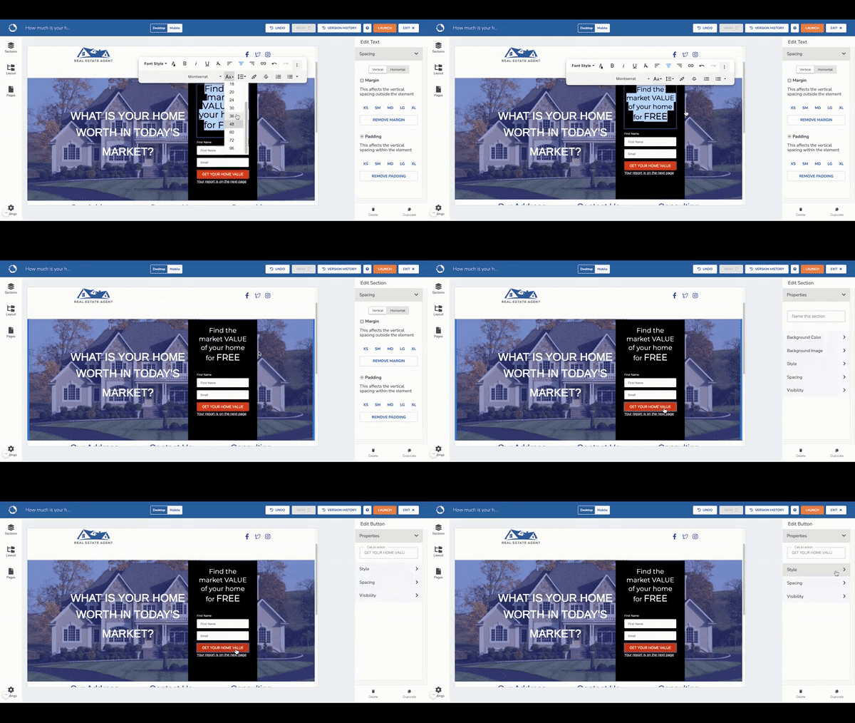
Listen. We’re not all web developers nor do we all have the budget to work with a web developer. That’s where landing page builders come in. A landing page builder is exactly how it sounds, it’s a drag and drop builder that is specifically made to capture leads with templates and best practices built in, no coding required!
And it just so happens that LionDesk has its own landing page builder that connects directly to your CRM Database, so you can have your lead capture and nurture all in one place!
Look at how easy it is:

If you already have LionDesk, you can easily add on landing pages here: Add Landing Pages to Your LionDesk
Yes, we are sending you to a landing page about landing pages, how meta is that??
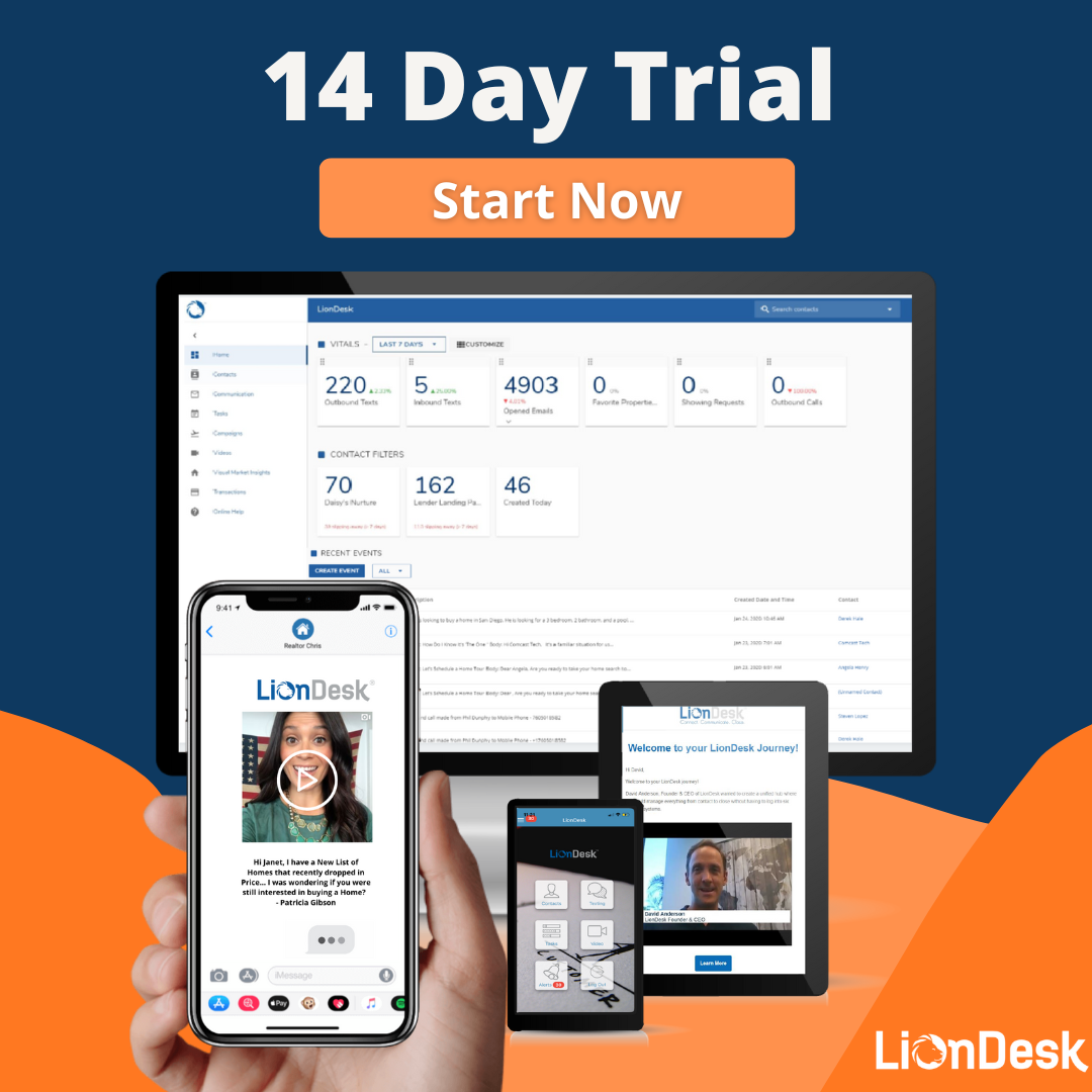
If you don’t have LionDesk yet (what are you waiting for??) As part of our 14 day free trial, you have the option to add on our landing page builder: Try Free for 14 Days
Now that you know all about how to build killer landing pages, you’re ready to go capture leads easily and effectively.
Go build some landing pages of your own and take charge of your business!


